
Enhanced Affordability
William Hill & 888 Occupation selection
Redesigning how William Hill &888 collects occupation data from customers, turning a friction-heavy compliance gate into a clear, trustworthy two-step flow.
My Role
UX Designer/Researcher
Status
Live: monitoring in progress
THE PROBLEM
A compliance requirement with a UX problem
Under UK gambling regulations (Enhanced Affordability checks), William Hill is required to collect and verify customers' occupation and employment status. The existing solution, a single-field pop-up with threat-led copy, created confusion, drop-off, and distrust.
The old design warned customers "we may restrict your account" with no context, a dismissible "Do it next time" escape, and no employment status step, just a raw job title field. It prioritised compliance over experience, and risked alienating customers at a sensitive moment.
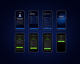
BEFORE
-
Single job title field, no employment context
-
Threat-led copy, fear-based framing
-
Yellow CTA, off-brand feel
-
Dismissible — "Do it next time" escape
-
No error states or validation feedback
-
No competitor precedent applied
AFTER
-
Two-step flow: employment status → job title
-
Reassuring, account-benefit framing
-
On-brand WH dark UI, consistent CTA
-
Required completion, no avoidance path
-
Full error state coverage, 3 failure modes
-
Patterns informed by 7 competitor audits
RESEARCH APPROACH
Before designing, I audited how other regulated and high-trust apps collect occupation data, looking at flow structure, copy tone, field patterns, and error handling.

Competitor benchmarking 7 products
These weren't chosen because they're gambling competitors, they were chosen because they face the same core UX challenge: collecting sensitive personal data from users who didn't ask to provide it, in a regulated context where completion is non-negotiable. Benchmarking within gambling would have anchored the redesign to a low baseline. Going outside the sector to fintech, where data collection UX is genuinely more mature, meant the new design could leapfrog industry norms rather than match them.
Revolut
Fintech
Employment status first, then free-text with tag chips. Progressive and low friction.
Monzo
Fintech
Multi-step: status → industry → job title. Detailed but well-paced with clear progress.
Chase
Fintech
Inline contextual prompt.
Framed around account benefits,
not compliance threat.
Starling
Fintech
Income source selection with illustrative icons. Friendly, non-intimidating framing
Opal
Regulated
Type-ahead search with immediate results. Clean and fast, no radio list needed.
Kraken
Regulated
Occupation dropdown with search. Mandatory KYC, completion non-negotiable
-
All leading fintech apps separate employment status from job title — never a single field
-
Trust-building copy ("helps us serve you better") consistently outperformed restriction-led warnings
-
Type-ahead search with a pre-populated radio list reduced input effort and errors across all audited apps
-
No competitor offered a "do it later" escape on a compliance-required field — completion was mandatory
A two-step flow built for trust and completion
The redesigned flow breaks the task into two focused screens, reducing cognitive load and making each step feel purposeful rather than bureaucratic.
-
Entry screen reframes the task as account maintenance, removing anxiety before the form begins
-
Employment status step gives context that makes the job title step feel logical, not intrusive
-
Job title search uses type-ahead with radio selectio, matching Revolut and Opal patterns users already trust
-
Back navigation returns to employment status, not the app , keeping users within the flow
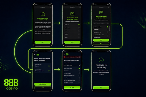
Entry
"Keep your account in great shape"
Step 1
Employment status
5 radio options
Step 2
Job title search
type-ahead + radio list
Done
"Thank you for submitting"
EDGE CASE
Full error state coverage, three failure modes
A key part of my contribution was mapping every failure path and designing distinct, actionable error states for each scenario.
Validation error
Invalid occupation, inline toast prompts correction without losing entered data and
prompt for "Other' if not found.
Generic failure
"Something went wrong." Full-screen error with Try again + Back recovery path
Save failure
"Your occupation wasn't saved." Distinct from submission error, same recovery, different cause
ITERATIONS
The flow was refined four times in Figma, each round sharpening copy tone, CTA hierarchy, and the employment status to job title step relationship.
Designs were built for both the William Hill light & dark UI and the 888 dark , and Mr Green lighter brand context.
